Showing posts with label Classes. Show all posts
Thursday, September 9, 2010
Peaceful Stampscape Night
It's a beautiful day outside and I'm off to catch a class at Destination Marysville where Connie has invited a representative of Tsukinko to teach us about their products! Before I go, I wanted to share another card from my Stampscapes Getaway Class this weekend - same store. This particular card reminds me of Saskatchewan and Alberta Canada, where my husband Gerald mostly spent his growing up years. It's barren, quiet, huge, lonely and sometimes beautiful. I would say it was always beautiful...but after experiencing it in the cold of winter with snow and wind blasting you at 60 degrees Celsius....I just can't say Glorious...you know??!! But if I had all my stamping around me and the dog was at my feet, with a warm fire burning close by??...I might change my mind...until it was time to do chores. Yikes....forget it!
With Stampscapes it's almost hard to stamp ugly. Get a white piece of paper and black ink and you're in business! I did mess with this one quite a bit though. I wanted to convey how the landscape made me feel...so there was quite a bit of fiddling. As long as my husband Gerald likes it?....I'm good!
Products Used:
Stampscapes Stamps:
Milky Way Lg. -059G
Tonal Applicator-084E
Farm-176C
Old Fence-293C
Leafless Limbs-052C
Tall Grass (sm) -254B
Windmill-190C
Inks
Stonewashed Adirondack
Pesto Adirondack
Black Soot - Distress Ink by Tim Holtz
More
Diamond Stickles
Glossy Paper-Inkssentials
Fragments- Idea-ology Charms - Tim Holtz
May Arts: Silver Cord SM31
Printed Cardstock: US font 12pt
Tuesday, September 7, 2010
Starry Stampscape Night
Everytime I come up with an idea for Stampscapes (especially when I book the class!) I hope like heck I can pull it off! I hope I find the tins I want, I hope that Stampscapes look good cut in 3, and I hope the stamps I picked work well together....because I already ordered them!! and I hope I can make a grouping that appeals because the class is this weekend!
I love how this worked out. It makes me wish that I was in that cabin reading a book with my feet up, a warm blanket, a glass of wine and the dog asleep on my lap! and....some dinner I didn't make myself! (but it still has to taste good!...maybe soup).
It's not a Christmas card. I'm not admitting that Christmas is coming, nor am planning for it....but you could use it for one? I take that back...it might make Christmas come faster. I just took the boys back to school. I haven't finished my Halloween classes yet. shhh....
Products Used:
Stampscapes:
Milky Way Lg. - 059G
Ledge - 054F
Tonal Applicator - 084E
Lakeside Cabin - 147F
Inks:
Denim Adirondack
Slate Adirondack
Black Soot by Tim Holtz (Distress Ink) This is now my favorite Black Ink (always open to others!)
Glossy Paper (Inkssentials)
Black Tie Bling by Bazzill
Snow Reflections by Favorite Findings
I printed Starry Night in Dark Blue ink with the US font at 14 pts
Monday, September 6, 2010
Pick of the Crop
I obviously haven't embraced the blogger mentality yet!! Events and commitments come one after the other and I drop all the website/blog stuff like a rock! More social media mentality required!
I'm playing catch-up with some classes coming up right now and am going to make it by the skin of my teeth. The card here is from a class I'm doing at Destination Marysville on Monday September 13th and Wednesday September 15th. I'd chosen my stamps quite a while ago and liked them....however, all the fruit in the stamp set were out of proportion with one another and I had to make each card using only one stamp because of it. I'll keep my eye out for that in the future!
I still have a thing for "inchies"....so I took advantage of this really cool Colorblocking mat from Accu-cut to frame out my cherries.
Here's a peek of the inside...
Again...because of the stamp set - I didn't mix up the fruit in any way. The class is made up of three matching cards - this being one of them - and so I used paper, style, product, and theme to match them together.
Product Used
Accu-Cut:
Squares - 1" S1894L
Colorblocking Mat A2 - Ju CB200J
Prismacolor Pencils:
PC926 Crimson Lake
PC937 Tuscan Red
PC946 Expresso
PC909 Spring Green
PC913 Grass Green
Stamps: Hero Arts CL320 Designer Fruit
KaiserCraft Rhinestones "Silver" SB700 (Clear)
Dotted Swiss Bazzill 12x12 "Pepper" Cardstock (Black)
Bazzill Prismatic Cardstock: Intense Kiwi
May Arts Ribbon: Checkered Black 3/8" AKN10
Glossy Accents by Inkssentials
Labels:
AccuCut,
Classes,
Colored Pencils,
Hero Arts
Wednesday, July 7, 2010
Blackwork
Let me just start by saying....I know a great dentist if you need one! One abcess tooth, an extraction and one temporary bridgework later and I'm a new woman! Done just under two hours by the way! She's awesome! Dr. Randa Jundi here in Port Huron - just around the corner from me - is my new hero! I didn't feel a thing....mostly! :)
So here's the last card for Connie's latest copic class at Destination Marysville. I kind of threw everything out the door that I've learned about mulitiple colors in the same family blending into delightful cohesiveness....and drove down the rabbit trail with hardly any markers. You can't tell from the pictures, but I used the dotted swiss papers from Bazzill since Connie has quite a collection at her store. I think I'm in love! (But not as in love with them as I currently am with my dentist!
Products Used
* Bazzill Dotted Swiss / Tahitian Princess
* Bazzill Dotted Swiss / Irish Eyes
* Bazzill Prismatics / Black
* Sakura Black Glaze Pen
* Sakura Clear Glaze Pen
* Versamagic / Wheat VG-82
Copics
* Cool Chadow
* W3 Warm Gray No. 3
* YG03 Yellow Green
* G85 Verdigris
Stamps
* Hero Arts Cling / Blossoms / CG148
* Memory Box / Just Note / B1053
Monday, June 28, 2010
Copic Blossoms
I meant to keep the second card for my next copic class simple and to stay away from warm colors....but somehow the stamps just wanted to go somewhere else! The blue and one of the greens are hot colors, but everything else turned into a warm color after that! There's a Batik feel to this card that I like and if I wasn't specifically using copics today - I would run in a totally different direction with this and chase the whole Batik thing.
When I teach at a place other than my studio - I get all anxious and stressed because I worry about remembering everything and hoping that I won't forget something vital at home where I can get to it...so that's it for the blog!! I'm so not a multi-tasker!!!
Products Used:
Cardstock:
* Bazzill / Dotted Swiss / Rope Swing? (picked it up from Destination Marysville!)
* Bazzill / Dotted Swiss / Sand Box?
* Bazzill / Prismatics / Black
Copics:
* BG10 Cool Shadow
* W3 Warm Gray No. 3
* YG03 Yellow Green
* G85 Verdigris
* Sakura Black Glaze Pen
* Sakura Clear Glaze Pen
* Versamagic Ink Pad / Wheat VG-82
Stamps:
* Hero Arts Cling / Blossoms CG148
* Memory Box / Just a Note B1053

Friday, June 25, 2010
Copic Hero
Just a little double entendre on the title there! I'm always relieved when I get stamps from a store owner to do a class with and something works out! (sometimes I sweat over it forever and Nothing works out!!! ...so I'm a Copic Hero for getting it done!). In this case the stamps are from Hero Arts and the coloring is done with Copic Markers...thus, "Copic Hero" again!
Last night I had an amazing time with all the very cool ladies that came to class. We were laughing so hard that they had to pause Mid-Stamp until the shaking was over. Everyone had funny stories and a great sense of humor and I slept like a rock after that because I truly relaxed from our fabulous evening of fun. I haven't had a shower yet because I dragged my sorry butt out of bed at the last minute to go to work! (here at the studio...I know - it's rough!) I'm feeling sorry for Kay right now because she had to drive home 1.25 hours last night and then get up in time for a meeting at 6am!!!! Hang in there sister!
This card will be part of a class at Destination Marysville on July 19th and a second date of July 21st. She just got in a supply of Hero Arts Stamps - so you might want to check it out!
Products Used
* Bazzill Dotted Swiss / Deep Pink
* Bazzill Prismatc / Intense Kiwi
* Hero Arts Cling Stamps / Blossoms CG148
* Zva Rhinestones
* May Arts Silk Ribbon / Pink SK17
* Button / Hero Arts / CH176 Spring Felt Buttons
* Gelly Roll / Clear Star
* Sakura Black Glaze Pen
Copics
* RV02 Sugared Almond Pink
* RV06 Cerise
* YG03 Yellow Green
* G85 Verdigris
* W3 Warm Grey No. 3
Last night I had an amazing time with all the very cool ladies that came to class. We were laughing so hard that they had to pause Mid-Stamp until the shaking was over. Everyone had funny stories and a great sense of humor and I slept like a rock after that because I truly relaxed from our fabulous evening of fun. I haven't had a shower yet because I dragged my sorry butt out of bed at the last minute to go to work! (here at the studio...I know - it's rough!) I'm feeling sorry for Kay right now because she had to drive home 1.25 hours last night and then get up in time for a meeting at 6am!!!! Hang in there sister!
This card will be part of a class at Destination Marysville on July 19th and a second date of July 21st. She just got in a supply of Hero Arts Stamps - so you might want to check it out!
Products Used
* Bazzill Dotted Swiss / Deep Pink
* Bazzill Prismatc / Intense Kiwi
* Hero Arts Cling Stamps / Blossoms CG148
* Zva Rhinestones
* May Arts Silk Ribbon / Pink SK17
* Button / Hero Arts / CH176 Spring Felt Buttons
* Gelly Roll / Clear Star
* Sakura Black Glaze Pen
Copics
* RV02 Sugared Almond Pink
* RV06 Cerise
* YG03 Yellow Green
* G85 Verdigris
* W3 Warm Grey No. 3
Thursday, June 24, 2010
Copic Hello!
One more Copic Card to match my other two using this particular set of stamps. I've already given the samples to Shannon from Remember When Scrapbooking and I don't have the list of products I used. I'm learning that I should really take the time to make more than one sample right away instead of putting it off. The chances of getting back to it get slimmer every day!!
I love this particular set of cards....if they didn't take so long to make I'd have a bunch hanging around for "mail emergencies!"... but I'm pretty sure once I do another set...they'll be saved into my card box for prosterity's sake! (as Marianne would say...."Sounds like too much Work!") to make a bunch.
Wednesday, June 23, 2010
Strawberry Fields
Yesterday I had what felt like the first class at my Studio in forever! I loved it. The nicest bunch of ladies you'll find anywhere...so it was a great way to get back into the game! What a wonderful time we had!
I asked everyone to vote on the new Tim Holtz/Sissix Embossing folder in the background because Hubby wasn't 100% sold on it. I didn't want to do it again...so I think the ladies just said..."sure...it looks nice!" hah! Anyway...it's staying!
While I'm sitting here doing this blog, my son Tristan (14) is doing the photos and entries for the website and my oldest son Michael (17) is weedwacking outside!!! Life is good!
Products Used:
* Bazzil / Blush Red Prismatic
* Bazzill / Kraft
* Pearls by KaiserCraft / SB795 Red
* May Arts Ribbon Red Gingham KB14
* Sissix: Tim Holtz Embossing Folder / Woodgrain #656644
* Hardware by Creative Impressions
* Unity Stamps / Berry Good Life / UK-433A
Prismacolor Pencils
PC1089 Pale Sage
PC912 Apple Green
PC1084 Ginger Root
PC925 Crimson Lake
PC926 Carmine Red
PC1094 Sandbar Brown
PC1967 Cool Grey 90%
PC1076 French Grey 90%
Labels:
Classes,
Colored Pencils,
Tim Holtz,
Unity Stamps
Saturday, June 19, 2010
Cup of Tea
I woke up today excited to post on my blog because I had colored and created and tried new things yesterday without feeling pressed. It's been good to get ahead of the classes and schedule a little. The website needs work, I need more experience taking pictures and using Paint Shop Pro... but on the whole, it's nice to start creating again without wondering if I could understand how to do calendars, websites, links, trims, borders, etc.
When I was tooling around blogs yesterday, I also realized I would have to start watermarking my cards again...which I had forgotten about. It's not so much to credit my work (ok, maybe that too!)- but requests from stamp companies to not make it so easy for the images to get reproduced without purchase. After talking with a tech guy from my hosting service, I was told there was almost nothing you could do anyway, since people who know what they are doing don't find it hard to take it off. What a shame! I'll still watermark the images when I put them in the website though...I don't think hackers are into coloring!!!
Demra put her blog up last night for the Nook and Cranny here in Port Huron, MI. I raced over there to be her first "follower"! Here it is....she's just getting started, but eventually there will be a beautiful montage of "Made in Michigan" Crafts to page through.
Products Used
* Bazzill / Blush Red Prismatic
* Bazzill / Kraft Cardstock
* Pearls by KaiserCraft / SB795 Red
* Charm by Frosted Creek Charms
* May Arts Ribbon / Gingham KB46
Cuttlebug
* Swiss Dots Embossing Folder
* Frills Embossing Folder Border Set
Prismacolor Pencils
* PC1089 Pale Sage
* PC 912 Apple Green
* PC1084 Ginger Root
* PC925 Crimson Lake
* PC926 Carmine Red
* PC1094 Sandbar Brown
* PC1067 Cool Grey 90%
* PC1076 French Grey 90%
Prismacolor Pencils
* PC1089 Pale Sage
* PC 912 Apple Green
* PC1084 Ginger Root
* PC925 Crimson Lake
* PC926 Carmine Red
* PC1094 Sandbar Brown
* PC1067 Cool Grey 90%
* PC1076 French Grey 90%
Unity Stamps Company: Berry Good Life / UK-433A

Labels:
Classes,
Colored Pencils,
Unity Stamps
Wednesday, June 16, 2010
Tim Holtz and Hardware
I was reading over the quote by General Patton that I printed on to this card and realized that I should have emphasized the "how" on the front of the card. After reading it for the first time in a week...it was almost a little too odd to pick up what he was trying to say the first time you read it. On top of that little problem....I had worked really hard to make a beautiful but plain inside for the card and then realized afterword that I had it oriented the wrong way! In other words, you would have to turn the card sideways when you opened it, to read the rest of the quote! I was about to rip it out when hubby said "why don't you leave it? It suits the sentiment." Great idea...and voila, I was done! I do think I'll rewrite the quote a little better for class so that the meaning of the quote comes through clearly.
Tim Holtz products seem to go great with hardware don't they? I loved messing around with the clear acrylic fragment pieces that have so many applications! All I did on this was print "creative" on matching paper with my printer, center the fragment over the word, trace, cut out, distress and adhere to the acrylic. I'm sure there are many solutions to adhering the paper...but what I did was use my favorite glue...Clear Art Glitter Glue....spreading it thinly on the fragment. I let it dry a little until it almost turned clear, and while it was still tacky, I smoothed on the paper so the word could be seen just under the acrylic. The chain is one of my very favorite "ribbons" from Creative Impressions! It's very mini and comes with cute little fasteners that are a bear to attach! Totally worth it!!

Products Used:
* sentiments printed with an HP printer. Fonts: Atlanta - 12pt and Stonehenge - 26pt.
* Zva Rhinestones (amber color)
* Beaded Chain by Creative Impressions
Tim Holtz
* Adirondack Alchohol Ink Applicator
* Idea-ology Fragments/Charms
* Sissix Alterations Dies: Scrollwork and Styled Labels
* Distress Walnut Ink
Paper
* Bazzill Grass Cloth Texture Cardstock / Stonehenge
* Cappella Mezzo by Basic Grey
* Cappella/Forte by Basic Grey
Monday, June 14, 2010
Copic Funky Tree
This is #2 out of the three funky copic cards that I've been doing for classes lately. I've really been enjoying some of the hotter colors and hope that I can start dreaming in them rather than my old fall favorites! I'm not sure I can go to hot orange yet...but it could happen!
I dusted off my old colored pencil display when I found out for sure that you can't get new ones that hold over a hundred different colors (hope they will later!). Mine holds 126 - so with my brand new display that only holds about 25-35? (have to get it out of storage) I should be set with enough room to start selling the full line. Hubby was helping glue and clamp (with bricks) on Saturday and it looks like we're back in business. There are some discontinued colors to take out and all the labels will get reprinted, some shopping to do...and Voila!
I never thought to take a picture while it was on it's side getting squished by the bricks...here it is though, ready to dust, label and organize!
Products Used
* Bazzill Criss-Cross texture / Swimming Pool
* Glossy Black - Prism Papers (now owned by Bazzill)
* Solar White Neenah 80lb Paper
* COPICS:
0-Colorless Blender
BG10-Cool Shadow
BG15-Aqua
BG49-Duck Blue
RV02-Sugared Almond Pink
RV06-Cerise
R29-Lipstick Red
C3-Cool Gray No.3
* Black Stitched Ribbon from Lasting Impressions (May Arts also has this product)
* Black Soot Distress Ink by Tim Holtz
Saturday, June 12, 2010
Watercolor Meadow
I'm having a weirdness moment, realizing that I've blogged for 3 days in a row and enjoyed it. I'm still attributing this to hanging out with Cath & Paula ...was it only last weekend? Maybe it was just a culmination of things coming together? Not sure! Not complaining either! Maybe it's because all the things I'm having to learn to be "electronic" instead of "brick & mortar" are settling in and I'm accepting the fact that I don't have a store anymore but not resenting it like I was? (the kids are doing much better by the way). Demra's been coming over and we've been yakking, cutting, wrapping and packaging...that's been great too! It's fun to listen to her retail savvy and wit!
Regardless, I've been creating like crazy and feeling good about expressing myself. I used to blog to help my business...but now I blog to say what I feel like. I don't mind linking everything up - but I just say whats on my mind. (should have done that first right?) I'm sure we're all rolling our eyes right now and saying "mid-life" crisis!....I think that was last year though!
Loved re-visiting my Tombow markers and making some simple cards. To me, this is something I want to give to friends or family that are going through tough times. It's peaceful, quiet, thoughtful and back to simplicity! I've already thought of some folks who could use some flowers and a card for a pick-me-up. Unfortunately...people who need some extra love are easy to find right?
Products Used
* Bazzill Bling / String of Pearls
* Bazzill / North Sea
* Pearls by Kaiser Craft / Chino
* Twill by Creative Impressions #80470
Tombow Markers
942, 990, 528, 993
Stamps
Unity Stamps / Insightful Meadow UK-442A
Friday, June 11, 2010
Funky Flowers
I'm more of a fall color person - so curbing my natural tendency to drift into those colors - I made myself switch to hot colors and eclectic design! Because I am by no means a copic master, (more like a copic crime perpetrator!) I've been sticking to simple designs where the same technique is done over and over again until it's practically bludgeoned into my brain! Then I say to myself...Okay...I think I got it! Let's try something else!
I also finished conquering (not an exageration...my eyes hurt) a new calendar with links and pictures and locations etc. and hope that you will love it and use it! Of course, the first thing my husband said was "where are the classes at the studio *?@# ??" (very mild language I assure you! punctuated by lizzy this and lizzy that) They're going to be in there I promise! I just wanted to make sure my committments to other stores was covered first! It takes awhile for me to learn new stuff (should have bought a Mac!). One more day or so and you will see at least one Studio class up there! (fingers crossed and losing blood flow!) Here it is! CALENDAR!
Product list
*Copics: 0-Colorless Blender, BG49-Duck Blue, BG15-Aqua, BG10-Cool Shadow, R29-Lipstick Red, RV06-Cerise, RV02-Sugared Almond Pink,
* Stitched Black Ribbon by Lasting Impressions
* Clear Rhinestones by KaiserCraft
Thursday, June 10, 2010
Shoreline
As much as I love Stampscapes - I sometimes think that I'm making a class that has to top the last one with technique, bells and whistles! After chatting a while with Connie from Destination Marysville we decided to make her next class accessible to not only our much loved and loyal Stampscapers but hopefully another interested set of folks who just want to make some great nature cards or manly cards...Me Too!
But how do you do that?? I was stumped for a bit and came up with some truly ugly cards .... until I came across some inspiration! Hallelujah! The important point about inspiration is to Not copy the artwork of another card maker and take credit for it....you just need to get pushed in another direction so that you grow, learn and get some inspiration. So check out this inspiration card from Beate Johns who is Fabulous! Beate used an "encaustic technique" involving irons and wax crayons that I'm happily avoiding (too much work) but you definitely have to watch the video and add her blog to your google reader list!
What I loved about it was the Spellbinder frame, the pearls and the Single Stamp! Everyone's got one great tree stamp right?? The next step was to add a horizon without using wax! hmmm... I decided on makeup sponges and masking. Everyone has that too right??
Now I was cooking! A few more cards hit the trash...and then I was off and running! Thanks Beate!
Products Used!
Stampscapes: Oak Tree (Medium) 178E
Coredinations Cardstock / Mantis
Black Tie Bazzill Bling
12 x 12 Imaginisce "Exotic East" Simply Nirvana
Adirondack Inks: Caramel, Red Pepper, Meadow, Pitch Black
Pearls by KaiserCraft: Denium , Black
Tuesday, June 8, 2010
Imagination...find it all over again!
I was so inspired this last weekend to continue creating just for fun, because I spent some time with two really neat people. I've known Cath for a couple of years now and am amazed at how much she has grown in her craft in such a short time. I took her class at Mary Maxim's so that I could be with her and Paula ... and was infected by her love of coloring.
Paula is a 1st Class colorist who specializes in colored pencil work. I've followed her blog for quite some time and had never met her until I took a class with her too! That opened up a whole new world for me. Check this blog out...You'll keep going back!
I was working on a class for Shannon and didn't take out "play" projects with my two friends - and came to the realization that I'd forgotten how, when I was sweating two days later with a style that I didn't feel comfortable with. Shannon and I wanted to explore Tim Holtz products for her customers and for ourselves...and what should have been fun...turned into a race against time to complete my personal deadline. Crazy!
I'm pretty sure Paula just colors in the evenings and then collects so much artwork that she can pick what she wants to do for a class and also for her blog. I determined to do the same. Thanks for the pick-me-up guys!
I wanted to take away the silver look of the charm here so I colored it with a dark moss green copic.
Ink: Distress Walnut Ink by Tim Holtz
Sizzix: Scrollwork & Styled Labels by Tim Holtz Alterations Dies
* Tim Holtz Idea-ology Fragments / Charms
* Beaded Chain by Creative Impressions
Paper: Bazzill Cardstock, Cappella/Mezzo by Basic Grey, Cappella/Forte by Basic Grey
* Adirondack Alchohol Ink Applicator
Monday, April 5, 2010
Little White Church
I love using a brayer to color my glossy paper. It's a little tricky. You'd think it would be better to start with the lightest color, but at a recent class, we discovered that starting at the bottom of the card with the darkest color will give us an opportunity later to re-activate the green in this case and blend it into the light blue gradually.
You can make this card at Destination Marysville on April 10th along with two other cards, lunch and access to several dozen Stampscapes Rubber Stamps so that you can take what you've learned and play for another 2 1/2 hours. Check out the Stampscapes website as well...it has the most amazing gallery and tutorials you'll find anywhere.
Labels:
April,
Brayer Work,
Classes,
Stampscapes
Tuesday, March 30, 2010
Another Copic Card
Wow...I always forget to blog. I think to myself...I have to do these ten things. I do that for a few days, and next thing you know. No Blog! I think I better start to do it first!
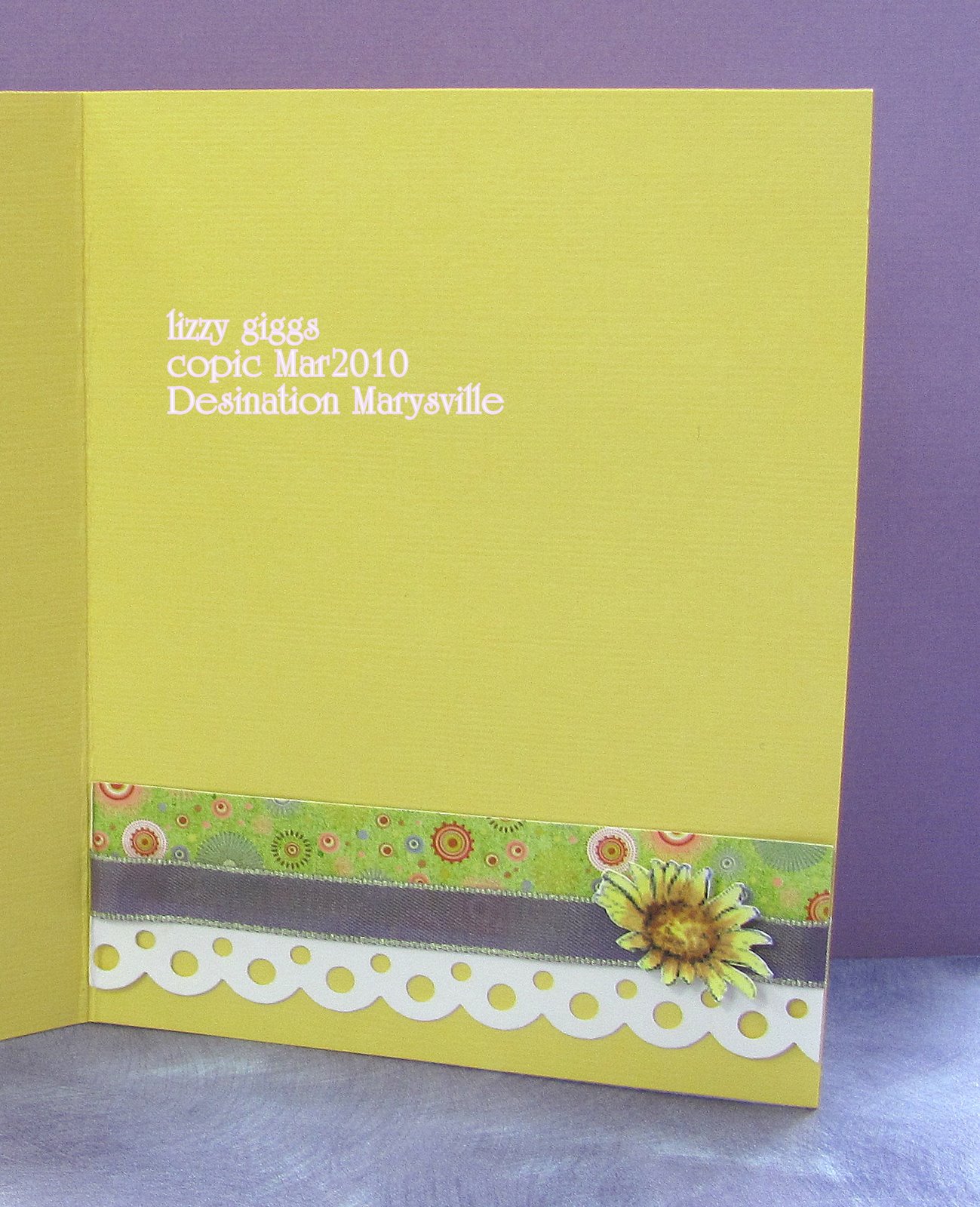
For those of you who took my class at Destinations Marysville...here is the 3rd Card just in case you want to check details again. By the time we finished all our daisies (sunflowers..whatever) we were very sure we knew how to blend yellow and brown!!
Saturday, March 13, 2010
CLASS: Copic Markers
This is the last of three cards I made for the Copic Marker Class at Destination Marysville. After introducing alot of material and techniques with the first two cards...I wanted to make sure that we could take advantage of of the last two remaining stamps in the set and still learn something that could be used in the future.
Hopefully you can click on the picture and see the details of the purple daisy a little closer. Remember that we were trying to make sure we didn't have to buy a lot of the Copic Markers to take this class...so what is a technique that you can use with only one marker??
Choose your color...in this case, lavender...and then remove color with the "colorless blender" from the middle of each petal. This takes away the intensity of the lavender and makes it look like the sun is leaving light on the top of each petal by exposing the original white of the paper.

One small, small detail is the pink flower...maybe you can see what I mean on the picture below...just touch your marker on the very tip of the petal and stroke inwards lightly. Make sure you leave no color on the end of the petal attached to the center. This helps to give a little color interest to even the smallest flower.
Hopefully you can click on the picture and see the details of the purple daisy a little closer. Remember that we were trying to make sure we didn't have to buy a lot of the Copic Markers to take this class...so what is a technique that you can use with only one marker??
Choose your color...in this case, lavender...and then remove color with the "colorless blender" from the middle of each petal. This takes away the intensity of the lavender and makes it look like the sun is leaving light on the top of each petal by exposing the original white of the paper.
One small, small detail is the pink flower...maybe you can see what I mean on the picture below...just touch your marker on the very tip of the petal and stroke inwards lightly. Make sure you leave no color on the end of the petal attached to the center. This helps to give a little color interest to even the smallest flower.
Friday, March 12, 2010
Copic Markers
A friend of mine decided to take the plunge and introduce Copic Markers at her store,
Destination Marysville.
After getting certified as an instructor I actually hadn't done much with them until she asked me to do a class. Needless to say, I've been practicing and trying to narrow done some methods and rules of thumb, that are simple and practical so that those attending can get the most out of what amounts to a fairly large commitment of moola!
Destination Marysville.
After getting certified as an instructor I actually hadn't done much with them until she asked me to do a class. Needless to say, I've been practicing and trying to narrow done some methods and rules of thumb, that are simple and practical so that those attending can get the most out of what amounts to a fairly large commitment of moola!
This actually isn't a great picture is it? I'm afraid if I go back and keep trying, I won't end up posting...so I'm leaving the photo perfectionism behind.
One of the interesting problems for a card marker is giving up the hope that you can stamp on something other than the great white paper blob. No stamping on fascinating patterns or cardstocks - because you really can only use the markers on a quality white cardstock! Now we have to finish and frame out the card in such a way that the great white blob doesn't take over the picture.
Also, if you want to have success with a class, you have to make sure they don't need to buy twenty markers, 3 sets of stamps and learn 10 techniques or shell shock will take over.
Monday, March 8, 2010
Class: Spring has Sprung ~ Card 3
This is the last card in my "Spring has Sprung" class. Nothing about the class is hard or complicated, and I hope that it will be good inspiration to keep everyone stamping!
Click here if you would like to sign up for this class.
I love to run classes when all three cards are made using the same set of stamps...especially if the set is small! That way, you know that if you purchase a set of clear stamps, you already have at least 3 ideas to get started.
Clear Stamp Set: "Natural Greetings" by Stampology ~ Autumn Leaves.
Other Supplies: Espresso Ink by Adirondack, Prism Paper, 12x12 from KaiserCraft, May Arts Ribbon, Maya Road Ribbon and die cuts from AccuCut
Subscribe to:
Posts (Atom)